Four Blue Details
The other day, I spent four hours at the De Young Art Museum in San Francisco. I only left because I was hungry and was wearing cruel sandals; otherwise, I could’ve easily spent another two hours. I love art and feel electrified by it. I left feeling completely changed after wandering through galleries seeing wildly inventive work that made many parts of my brain light up.
As a freelance writer, I’m often able to place stories on the exhibitions I see, and I’m proud of many stories I was able to write—I’ll link to a few selections below, such as a Smithsonian article on Wayne Thiebaud based on a phone interview that day after he turned 100, Time Out stories about fantastic SF MOMA exhibitions by artists like Kara Walker and Amy Sherald, and the Disney Family Museum exhibit featuring work by Mary Blair, as well as a roundup I wrote for Washington Post about the best airport art. I’ve written 20 art-based articles in the last decade… but there are so many more that I pitched and wasn’t able to place with a publication.
I decided that it’s time to start putting some of those here on my website under the tab “Art,” even if it’s just a musing about one piece I see somewhere or a full-on exhibition that deserves attention I couldn’t garner for it.
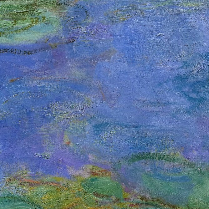
My inaugural post will be a close look at details of four paintings at the De Young, and how they seem interrelated to me. I’m going to post the photos first, and let you form some ideas about them, and then talk about them.
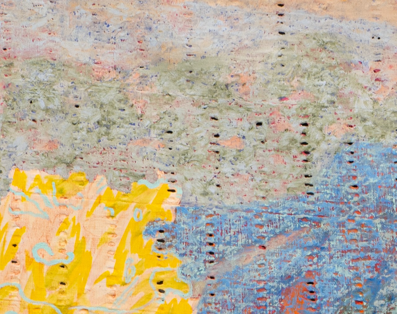
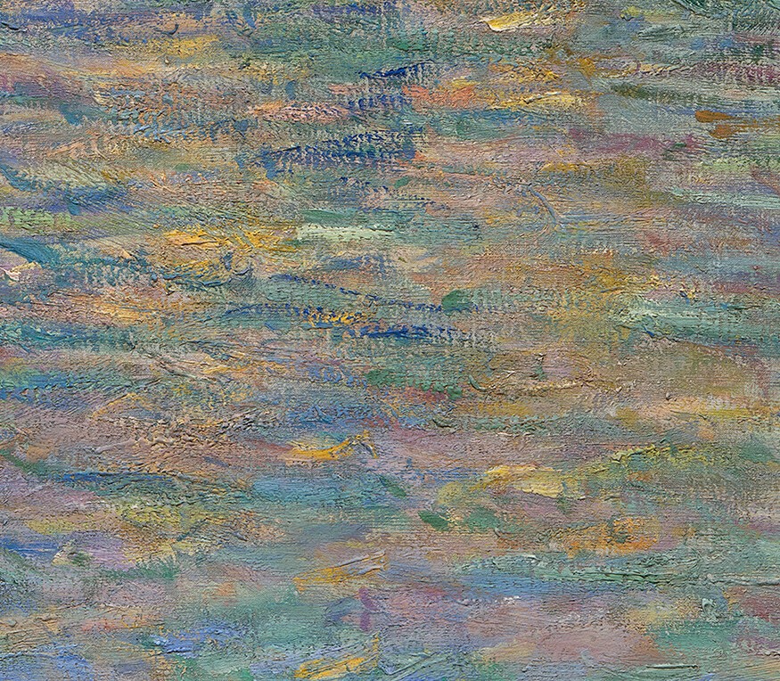
I came to the De Young to attend a press preview of the upcoming Nengi Omuku: The Gathering exhibition, Omuku’s first solo show in the U.S. She’s a Nigerian artist who paints on the back of sanyan, a fabric handwoven in narrow strips and then sewn together. The fabric was once used for royal garments. I was knocked out by her eight large-scale pieces. I loved how many of the pieces created something beautiful out of what could be considered ugly. For instance, one piece features yellow jerry cans, quotidian metal vessels at best, and at worst too bright and indicative of the unfair need to carry water rather than turn a tap and have it free-flowing. Looking at this piece from a distance, turning my head while talking to one of the museum’s press contacts, I gasped because it looks like a garden lush with bird of paradise flowers. In another piece, Omuku’s beautiful Impressionist blur—with her own stamp on it—evoked Monet for me, both in color choices and in feel.
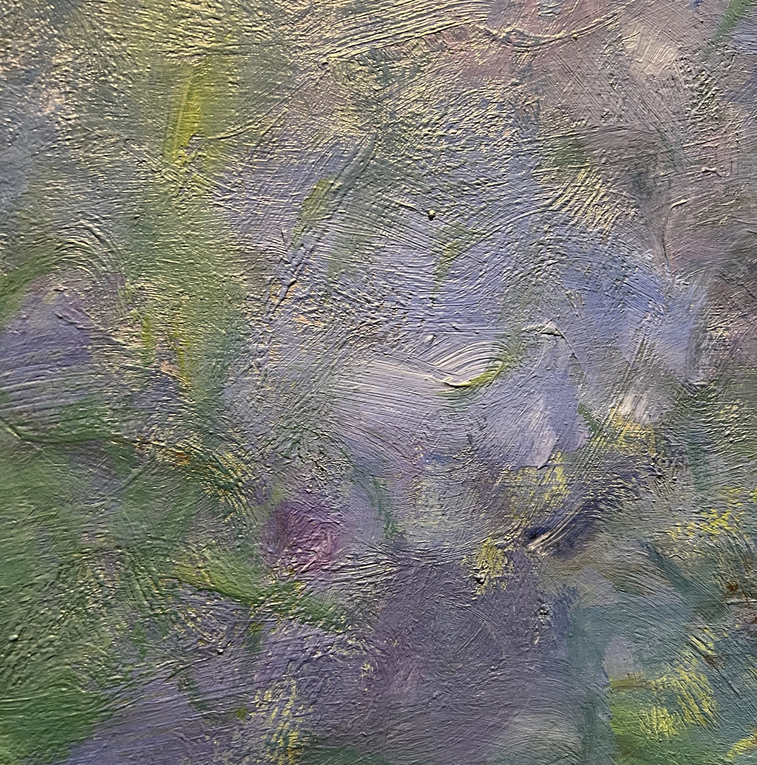
I went into the Monet exhibit and drifted on these incredible light-filled watery surfaces. One of the exhibit’s conceits is that the work Monet did painting the canal waters of Venice prepared him to return to the Giverny water lilies which he had lost faith in, and lift them up to the status they have today: some of the world’s most recognizable art. And so I spent some time really looking at the brushwork and the colors, and I felt that there was perhaps a progression I could see where the water lilies benefited from more saturated colors post-Venice. See what you think – can you see Monet in Omuku’s piece, and do you think Monet’s approach to painting water changed from before, during and after Venice?
From left:
Detail, Fire for Fire by Negni Omuku, 2025
Detail, Water Lilies by Claude Monet, 1907
Detail, Grand Canal, Venice, by Claude Monet, 1908
Detail, Water Lilies by Claude Monet, circa 1915-17